Showing posts with label Latin. Show all posts

Monday, March 5, 2018

Download Sortie Super Font by Lewis McGuffie Type

Download Sortie Super Font by Lewis McGuffie Type

Download Sortie Super Font by Lewis McGuffie Type

Sortie Super font - designed by Lewis McGuffie bring flexibility and beautiful typefaceThis font was designed for attractive design like magazines and logotypes.

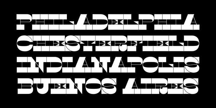
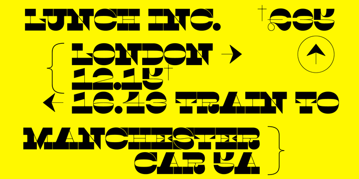
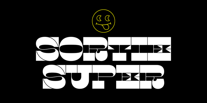
Sortie Super is a take on one of the kings of display lettering - Caslon’s high-contrast, reversed stress ‘Italian’ style. It looks great at big sizes and in short flurries... and shouldn't be used in confined spaces. 

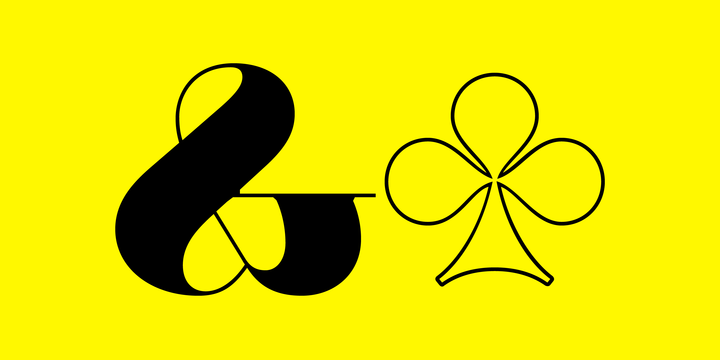
When compared with the original face, the weight and contrast of Sortie Super has been exaggerated. To add gravity to the letters I've increased their width overall and reduced the spacing to a hair-line fracture for added visual impact. Characters like ‘S’, ‘E’,‘O’ and ‘Z’ are relatively close to their historical precedents - however the terminals on the 'C-G-S-З-Є‘, which have been drawn so to be more consistent. Other aspects, such as the leg of the ‘R’ and ’Я‘, the apex of the ‘A’ and the spur of the ‘G’ are revised and simplified, to help spacing and optical weight across the alphabet. Also, to reduce visual noise terminals in characters like ‘C’, ‘J’ and ‘R’’ are horizontally aligned. Meanwhile, the central horizontal strokes in the ‘B’, ‘P’ and ‘R’ etc are reduced to a hairline, so as to create a more simplified system of thick-to-thin. 

The temptation when drawing this kind of esoteric display alphabet is to start to rely on modular components. Which, while copy-paste-repeat is a sure-fire way to make the face more visually consistent, it’s a lazy method that risks allowing the font become soulless and mechanical. An early experiment I made was making a monospaced version, which was useful in headlines, but it lost that loving feeling. So, by maintaining a handful of flourishes – the tail of the ‘?’, the inky drop of the ‘!’, the bulbous gloop of arms of the 'Ж‘ and ’К', the swirling legs in the ‘R’, 'Я‘ and ’Л', the big-bowling weight of the ‘J’ and ‘U’ – plus a few in-built inconsistencies and a bit of its own silliness, Sortie Super retains some of the organic warmth of its ancestor. Conversely, the counters, apertures and negative space are largely rigidly geometric, which helps give the revival font a bit of a modern touch.

Sortie Super is an uppercase-only display font that comes with Western, Central and East European Latin, extended Cyrillic, Pinyin, as well as a set of hairline graphic features and symbols. 

Gallery and Sample :


Tuesday, February 20, 2018

Download Mafond Font by Etewut

Download Mafond Font by Etewut

Download Mafond Font by Etewut

Mafond font - designed by Alex Etewut bring flexibility and beautiful typefaceThis font was designed for attractive design like magazines and logotypes.

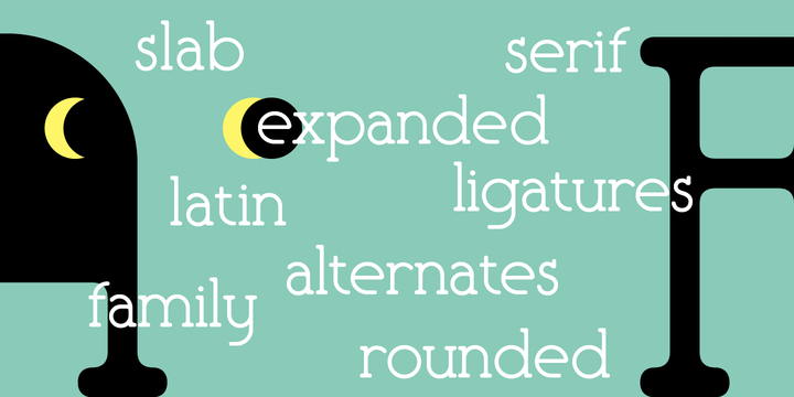
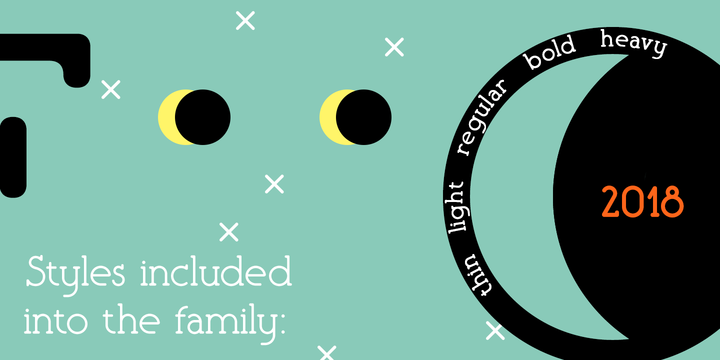
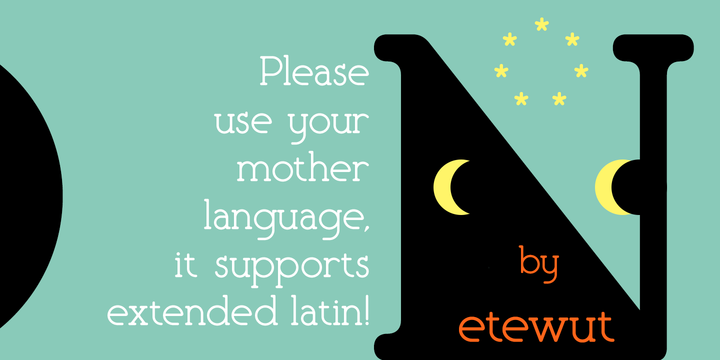
Mafond is a fresh slab serif. It supports all european languages. The family is rounded as never before and includes 5 styles. Each of them has alternates for basic latin and a couple of ligatures. In case of success Mafond becomes Yofond.

Gallery and Sample : http://myfonts.us/46e7Nb


Thursday, January 25, 2018

Download SF Handwriting Font by Sultan Fonts

Download SF Handwriting Font by Sultan Fonts

Download SF Handwriting Font by Sultan Fonts

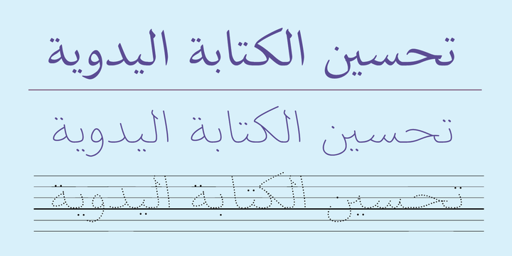
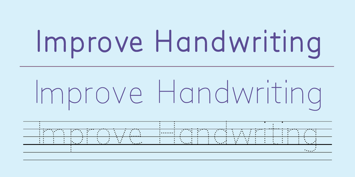
SF Handwriting font - Say hello to new SF Handwriting font family designed by Sultan M. Saeed, SF Handwriting fonts release at Jan 24, 2018. SF Handwriting is the perfect titling font to complement text faces in magazines, logotypes, etc.

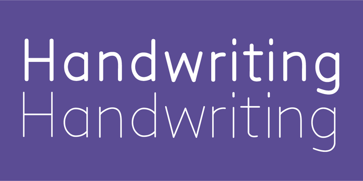
The SF handwriting font family designed for educational and printing purposes, using Pen or pencil. All of the weights were carefully adjusted to each other. Every single letter has been carefully crafted to make your text looks beautiful. Using SF handwriting in small sizes is very convenient.

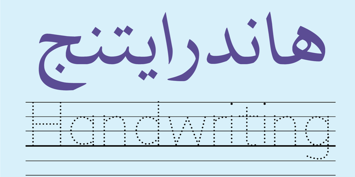
The typeface SF handwriting contains 3 weights: Regular, bold and black. The Dotted style Designed with straight background for print and overwrite by kids or other users.

SF handwriting font family includes a design that supports Arabic, Latin, Persian, and Urdu, as well as relative numbers for those supported languages. The Font is characterized by clarity, ease and vision as it is a very carefully prepared font to be used in the document so as not to distract the attention of the reader.

Gallery and Sample : http://myfonts.us/u4QtO5


Saturday, November 4, 2017

Download Lisboa™ Font by Vanarchiv

Download Lisboa™ Font by Vanarchiv

Download Lisboa™ Font by Vanarchiv

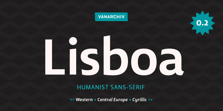
Lisboa™ font - Released by Vanarchiv and start debut at Nov 3, 2017. Lisboa™ font designed by Ricardo Santos, this font is perfect choice for your design.

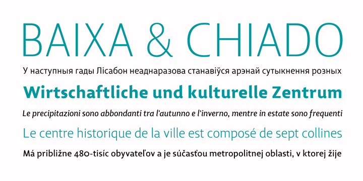
This humanist sans-serif typeface was exhaustively designed, full-featured typeface family that reveals its character and distinctiveness in complex text. It features a large complement of ligatures, lining and old-style figures, expert characters, dingbats (arrows, brackets, and symbols for both Regular weights). In the original Lisboa Pro the forms of the letters are humanist, with hooked headterminals, the characters contains medium contrast with a left-angled stress on the strokes. After ten years from the first version publication, this new version (0.2) is available with Latin (Western, Central Europe) and Cyrillic alphabets. It was selected by Our Favorite Fonts of 2005 (Typographica).

Gallery and Sample : http://myfonts.us/Or4dPr


Download Lisboa Sans™ Font by Vanarchiv

Download Lisboa Sans™ Font by Vanarchiv

Download Lisboa Sans™ Font by Vanarchiv

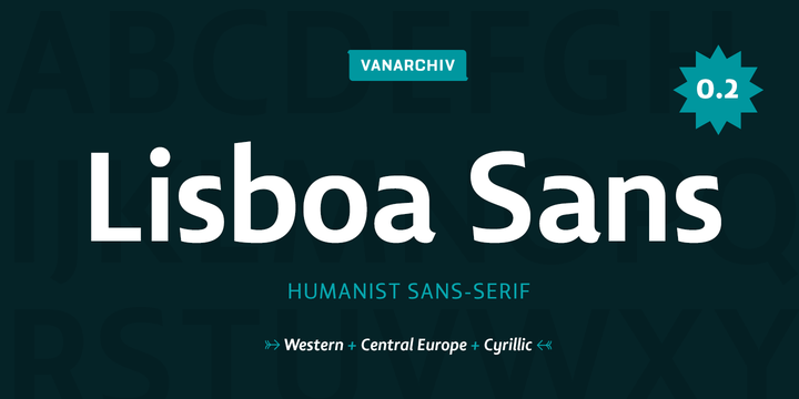
Lisboa Sans™ font - Say hello to new Lisboa Sans™ font family designed by Ricardo Santos, Lisboa Sans™ fonts release at Nov 3, 2017. Lisboa Sans™ is the perfect titling font to complement text faces in magazines, logotypes, etc.

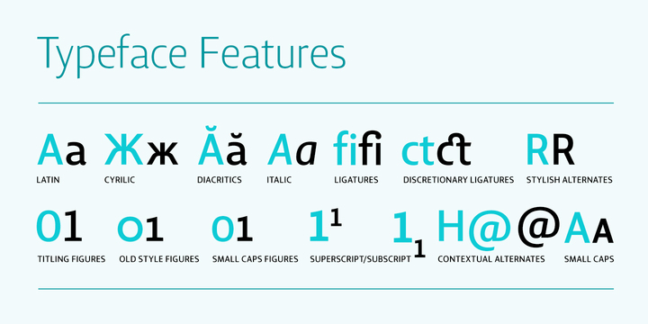
This humanist sans-serif typeface was exhaustively designed, full-featured typeface family that reveals its character and distinctiveness in complex settings. It features a large complement of ligatures, lining and old-style figures, expert characters, dingbats (arrows, brackets, and symbols for both Regular weights). Lisboa Sans lacks the hook-head terminals, but its structure and proportions are the same. The simplicity of the sans weight created very strong readability at small sizes. After ten years from the first version publication, this new version (0.2) is available with Latin (Western, Central Europe) and Cyrillic alphabets. It was selected by Our Favorite Fonts of 2005 (Typographica).

Gallery and Sample : http://myfonts.us/jpDAPo


Wednesday, October 18, 2017

Download LP Harmonia Font by FontForum

Download LP Harmonia Font by FontForum

Download LP Harmonia Font by FontForum

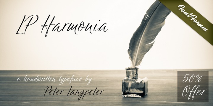
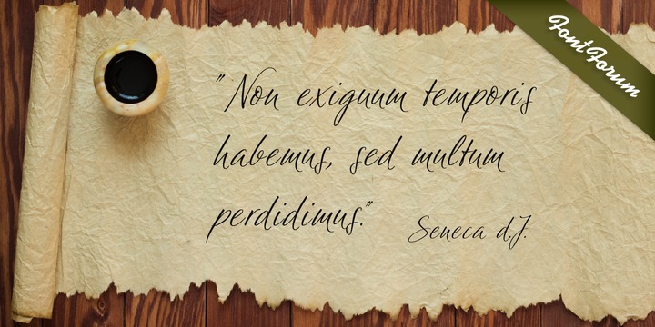
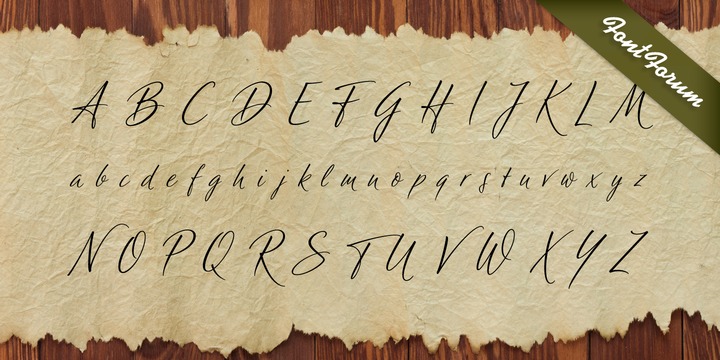
LP Harmonia font - Released by FontForum and start debut at Oct 17, 2017. LP Harmonia font designed by Dior Sirous, this font is perfect choice for your design.

LP Harmonia arose from its designer’s private life. As a type designer, Peter Langpeter was often asked by friends or relatives to write a greeting on a birthday card or create a good looking invitation.

Over the years, he used ink and a soft feather to form his personal handwriting: LP Harmonia.

Download :
Gallery and Sample :


Thursday, September 28, 2017

Download Gazeta Font by Vanarchiv

Download Gazeta Font by Vanarchiv

Download Gazeta Font by Vanarchiv

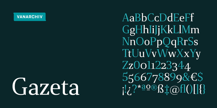
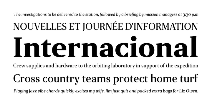
Gazeta font - Say hello to new Gazeta font family designed by Ricardo Santos, Gazeta fonts release at Sep 28, 2017. Gazeta is the perfect titling font to complement text faces in magazines, logotypes, etc.

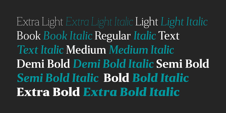
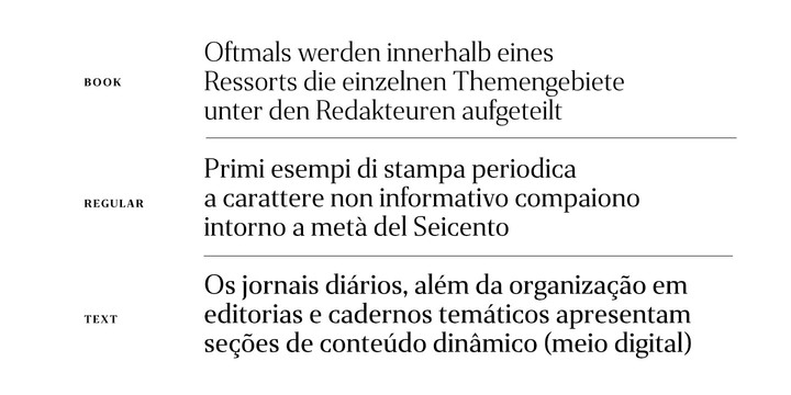
This typeface was designed for editorial purposes (text sizes), where the letterforms contain short serifs (more economical). This font family contains different weights (from Extra Light until to Extra Bold) to create an simple and sequential typographic hierarchy scale. There are two different weights and options designed specifically for text sizes (Regular and Text). The design is classical but contain some contemporary details, which are not distractive for reading, it’s simple and clean at small sizes. This font family include italics, small caps, ligatures, old style and tabular figures.

Gallery and Sample : http://myfonts.us/fJGLxy