 |
| Download Posh Font by Lián Types |
Posh font - designed by Maximiliano Sproviero bring flexibility and beautiful typefaceThis font was designed for attractive design like magazines and logotypes.
I've always been in love with fat didones. That’s the reason of Posh.
In search of something unique, I started this family back in 2013 with the aim of creating the fattest yet readable bodonian typeface in the market: It was a challenge, because roman fonts need generous counters (or what some call white spaces) and taking them to the extreme of inexistence attempted against the construction of many glyphs. Ears, dots, terminals and serifs always need some extra space so I had to find the exact point of boldness to make characters which have those attributes work well in the middle of those which haven't. (1)
After a while, I felt I was again ‘in my element’: Big contrasted letters, sexy and elegant curves, and that Lubalinesque feeling that characterise my fonts. (2)
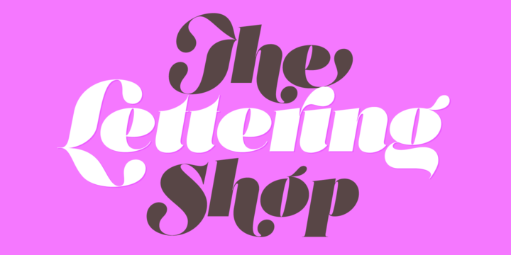
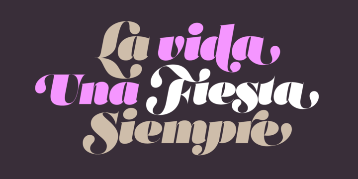
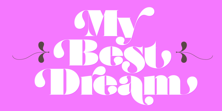
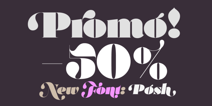
Words written with Posh are a explosion of elegance and sensuality due to the fact that its didone attributes were exaggerated. Since it’s full of alternate glyphs, one can change and choose them until a nice block of ‘‘black’’ is achieved. (3)
To accompany the regular style, I designed Posh Inline, a font with the same quantity of glyphs than the regular one; an all caps style called Posh Capitals, and also a really playful Italic version.
I hope you find this one delicious like I do! This font is dedicated to all who understand letters are not just meant to be read, but also to be appreciated in group and individually.
Enjoy it.
NOTES
(1) In example, it can be easy to design a fat letter ‘n’ with almost no counter, but really tough to make a satisfactory letter ‘s’ with serifs to match that ‘n’.
(2) Also, it wasn't my first attempt in fat didones. Take a look at my font Reina, made in 2012.
(3) Posters above show many words with ball terminals that seem to dance above and below the words in order to fill those “undesired” blank spaces.